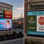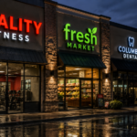
When Columbus retail owners invest in exterior commercial signage, the focus often naturally drifts toward size, placement, and municipal code compliance. While these factors are undeniably critical, one of the most powerful elements of a successful storefront sign is frequently overlooked: the psychological impact of color. The colors chosen for illuminated channel letter signs do more than just display a brand name; they communicate subconscious messages, evoke specific emotional responses, and directly influence consumer behavior before a customer ever steps through the door.
Understanding color psychology is essential for retail owners looking to maximize the return on their signage investment. In the highly competitive Central Ohio retail market, where split-second decisions are made by passing motorists, the right color combination can be the difference between blending into the background and capturing a new customer.
The Subconscious Impact of Primary Colors
Every color carries a psychological weight that influences how consumers perceive a brand. When applied to illuminated channel letters, these effects are amplified by the brightness and contrast of the LED lighting against the night sky or a building facade.
Red is the most aggressive and attention-grabbing color in the spectrum. It physically stimulates the body, raising the heart rate and creating a sense of urgency. This makes red channel letters incredibly effective for fast-food restaurants, clearance centers, and entertainment venues where impulse decisions are encouraged. However, for a high-end boutique or a spa, red may convey an unintended sense of aggression or cheapness.
Blue, in stark contrast, is the color of trust, security, and tranquility. It is the most universally favored color and is heavily utilized by financial institutions, medical facilities, and corporate offices. Blue illuminated signs communicate reliability and professionalism. For a retail business, blue suggests that the products inside are dependable and the service is trustworthy.
Green is inextricably linked to nature, health, and wealth. It is the easiest color for the human eye to process, making it a soothing choice for exterior signage. Green channel letters are the standard for organic markets, dispensaries, landscaping companies, and financial advisors. It signals growth, eco-friendliness, and vitality to passing consumers.
Strategic Color Combinations and Contrast
While the primary brand color sets the emotional tone, the effectiveness of an illuminated channel letter sign relies heavily on contrast. A sign that is psychologically compelling but visually illegible is a failed investment.
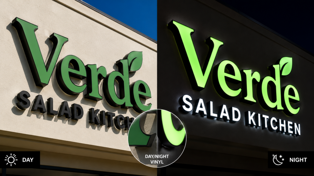
High contrast is non-negotiable for commercial signage. The classic combination of white channel letters on a dark building facade offers maximum visibility. White light is pure, modern, and highly legible from a distance. Many successful retail brands utilize “day/night” vinyl on their channel letters. This specialized material appears as a specific brand color (like dark blue or black) during the day but illuminates as bright white at night when the internal LEDs are activated, ensuring maximum visibility 24 hours a day.
Conversely, poor contrast can render an expensive sign useless. Placing dark red illuminated letters against a dark brick background will result in the sign “muddying” together at night. Professional sign manufacturers understand how to use contrasting trim caps, returns (the sides of the letters), and backer panels to ensure that the primary color pops rather than fades into the architecture.
The Role of Illumination in Color Perception
The transition from daytime to nighttime completely alters how colors are perceived. A brand color that looks vibrant on a printed business card may appear washed out or entirely different when illuminated by LEDs in a channel letter sign.
This is where the expertise of a specialized commercial sign company becomes invaluable. Legacy sign shops often use standard, off-the-shelf LEDs that can distort the intended color of the translucent vinyl face. For example, a warm brand yellow might appear sickly green if illuminated by a cool-white LED with a high Kelvin temperature.
Modern sign manufacturing utilizes precision-matched LED modules that are specifically calibrated to enhance the true color of the vinyl face. This ensures that the emotional impact of the brand color remains consistent and powerful, regardless of the time of day.
Elevating Your Retail Presence
Choosing the right colors for your illuminated channel letter signs is a strategic business decision that requires balancing brand identity, psychological impact, and technical visibility. A sign that leverages color psychology effectively will work tirelessly to attract the right demographic to your Columbus retail location.
By partnering with a sign manufacturer that understands both the art of color psychology and the science of modern LED illumination, retail owners can ensure their storefront stands out in the crowded commercial landscape.
Frequently Asked Questions
How does the color of a sign affect customer foot traffic?
Color directly influences subconscious decision-making. Warm colors like red and orange create urgency and draw impulse buyers, making them ideal for quick-service retail. Cool colors like blue and green build trust and calm, which is better suited for high-value or health-oriented businesses. The right color aligns the exterior message with the interior customer experience.
Can I use my exact brand colors for an illuminated sign?
Yes, professional sign manufacturers use high-quality translucent vinyl films from brands like 3M and Avery Dennison that can be precisely matched to your brand’s Pantone colors. Additionally, the internal LED lighting is calibrated to ensure the color remains accurate when illuminated at night.
What are day/night channel letters?
Day/night channel letters utilize a specialized perforated vinyl on the face of the sign. During the day, the letters appear as a dark color, such as black or dark blue, matching the brand identity. At night, when the internal LEDs turn on, the light shines through the perforations, making the letters appear bright white for maximum nighttime visibility.
Why is my current illuminated sign hard to read at night?
Illegibility at night is usually caused by poor color contrast or light diffusion. Dark colors like deep blue or red do not transmit light as effectively as white or yellow. If dark letters are placed against a dark building without a contrasting border or “halo” effect, the edges of the letters blur together, making the sign difficult to read from a distance.
Recent Posts